TEN effective ways to create e-commerce CTA buttons
5 min read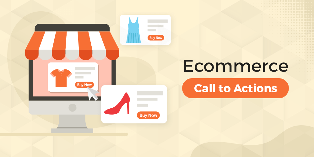
Your e-commerce store has a beautiful design and is easy to navigate. You are investing in SEO and digital marketing techniques like CTA. You often create social media campaigns and doing whatever it takes to grow your online business.
Good!
Nevertheless, you are not happy with the conversion rate. You keep asking why visitors are not adding products to their cart. Is it your website design or user interface? Should you change your digital marketing strategy?
You have done the research and found nothing abnormal.
What is the problem then?
What is Call to Action (CTA)?
Often, a tiny mistake can cost you hundreds of dollars. We believe you have not given enough attention to creating a Call to Action button that is effective. CTA allows the visitor to take the action you want. There are many guidelines for CTA placement, font shape, graphics, and layout. A simple call to action button may grab the visitor’s attention and encourage him to purchase the product.
Here, we will share ten tips to create a practical CTA button to increase conversions.
A colorful CTA button
When it comes to achieving high conversion rates, colors matter, the most effective CTA button uses striking colors to stand out against the background. You will need to apply different colors to determine which one looks better. Your website’s design will determine if it grabs a user’s attention. Do not forget to keep it in line with your brand’s overall design.
CTA button shape and size
The button should be large enough to grab the attention of the visitor immediately and easy to click. The button’s shape is also crucial in converting visitors. You can experiment with simple shapes like rectangular or rounded one. Any form can work depending on your store’s design. Rectangular buttons are the most common on e-commerce websites to make them easier to see.
Let the AI help you
We suggest personalizing the text by using direct speech. You can use expressive words to create an emotional impact on your visitors and push them towards your goal. You can say ‘Sign up’ instead of ‘View Cart’ and ‘View My Cart’ instead of ‘View Cart. This psychological trick will make visitors feel more at home and more likely to do their desired actions.
Safety and internet security
Secure card processing and advanced checkout security are essential in eCommerce. Your clients will leave if your shop is not confident enough. You should inform your customers that you have installed advanced security solutions in your shop. Users will click more often if you add the words – secure checkout, certified shopping, no risk, money-back guaranteed, 100% refund, etc.
A CTA button must convey the message.
The goal is to convince the audience to click on the call to actions button. Here is where your copy will translate into actions. Action-oriented words and phrases help the user to decide what they should do next. The following are some of the most effective action verbs – buy now, add to bag, get access, join or register, place your order, etc. Make it more appealing for users to click on the action words. Personalized calls-to-action will make your visitors feel at ease.
CTA button and value proposition
A way to get your visitors to take the action you desire is to tell them what they can expect to receive. The value proposition is a powerful tool because it informs people that you are honest and generous in exchange. You might send emails to promote a 25% discount or a free eBook. The CTA copy should confirm and highlight the promised value. Enjoy a 25% Discount, a Free Coupon, a Free Subscription, Free Shipping – these are just a few examples of how to use the value proposition in CTA.
A bonus text below the CTA
Are you looking to give users additional information? You may want to include some messages with the CTA button text in many cases. You could assure users that they will not receive spam emails or that their personal information will be protected. Alternatively, you could also inform them about payment methods, etc. It is possible to add that bonus text just below the CTA button.
A CTA button with an urgent appeal
When you want to get people’s attention, make them feel like they have less time left. It can be achieved by using timing words with the CTA, such as ‘shop today’ or ‘get one now,’ ‘sale ends soon, etc. if you’re not sure what works best, try out different options until you find one that converts well enough for your store.
Include fun graphics to CTA
Sometimes the most creative way to get your customer’s attention is by using a fun graphic. A funny-looking arrow or character that points at CTA buttons can be an eye-catching and memorable form of advertisement. Place your CTA at the beginning of the webpage to engage more people. Curiosity is the desire to know something. Therefore, if you design a call-to-action message to create that curiosity, people will contact you knowing that they can trust you. They are also willing to press an action button when trusting someone or company enough.
Consult with an expert
An excellent way to make your landing page and call-to-action buttons look great while also performing is by getting help from a professional website designing company in Delhi. Remember that when designing your CTA buttons, you should not be going on with long sentences of text leading up to them. Keep all associated text simple, short, and sweet not to confuse potential consumers or get in the way of their clicking through faster than ever before.
Conclusion
By now, you know the importance of having a call to action button. It’s a crucial part of conversion optimization. Tweaking even one little thing about these can dramatically impact the success or failure of your site, and you do not want either option. According to data, around half of web traffic happens on a mobile device, so the CTA you use must be optimized and viewable just as well from a phone screen as they do with normal desktop browsing.
Also Read: 8 Tips for Managers to Let an Employee Go Without a Scene